My Sunrise
My Sunrise is the customer care platform that allows users to manage subscriptions, services, and account related tasks.
While working on multiple initiatives, it became clear that the current platform was not ready to support all the upcoming initiatives and needed to evolve.
The existing framework made it difficul to introduce new experiences and features without increaseing complexity or duplicating navitation, resulting in a fragmented experience.
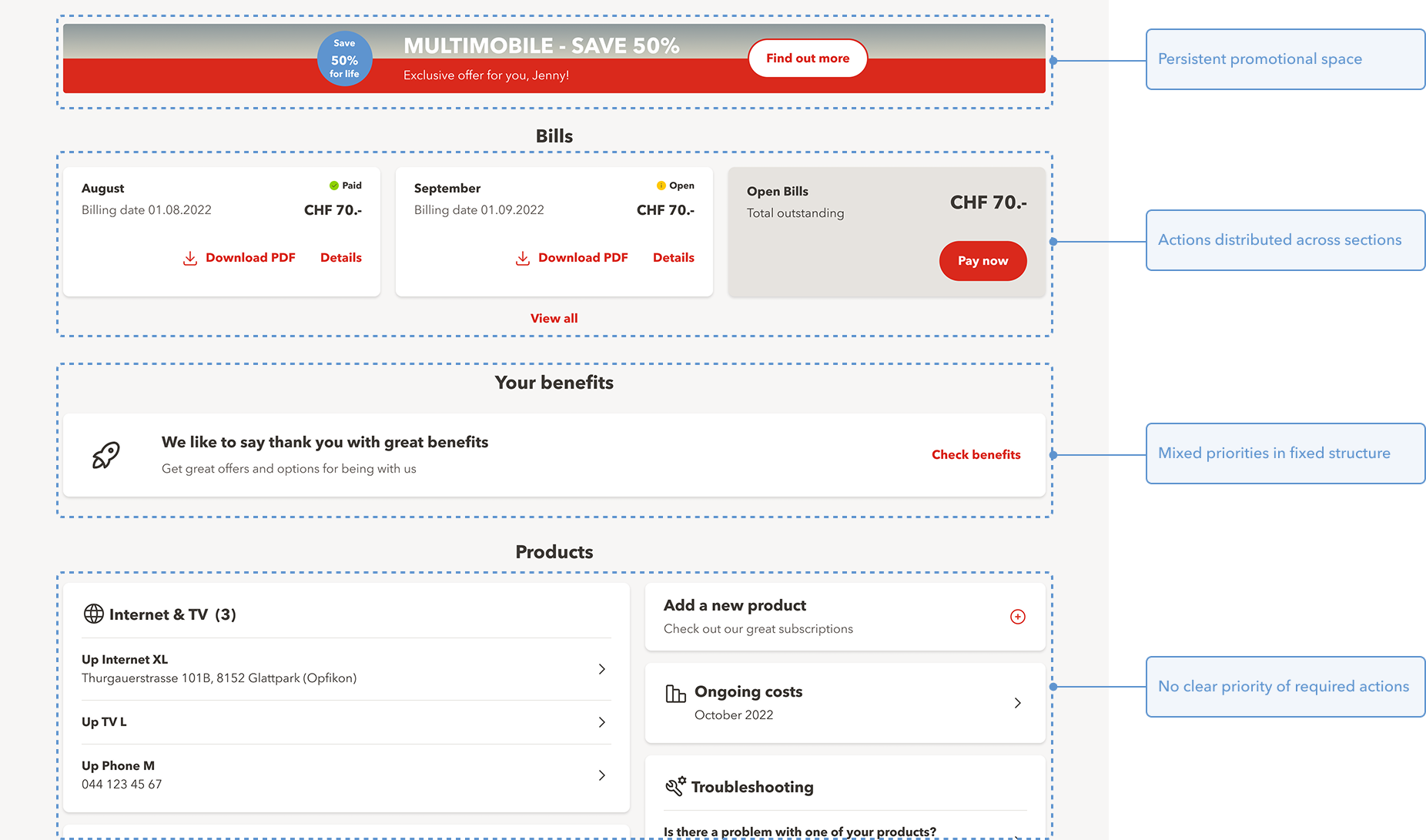
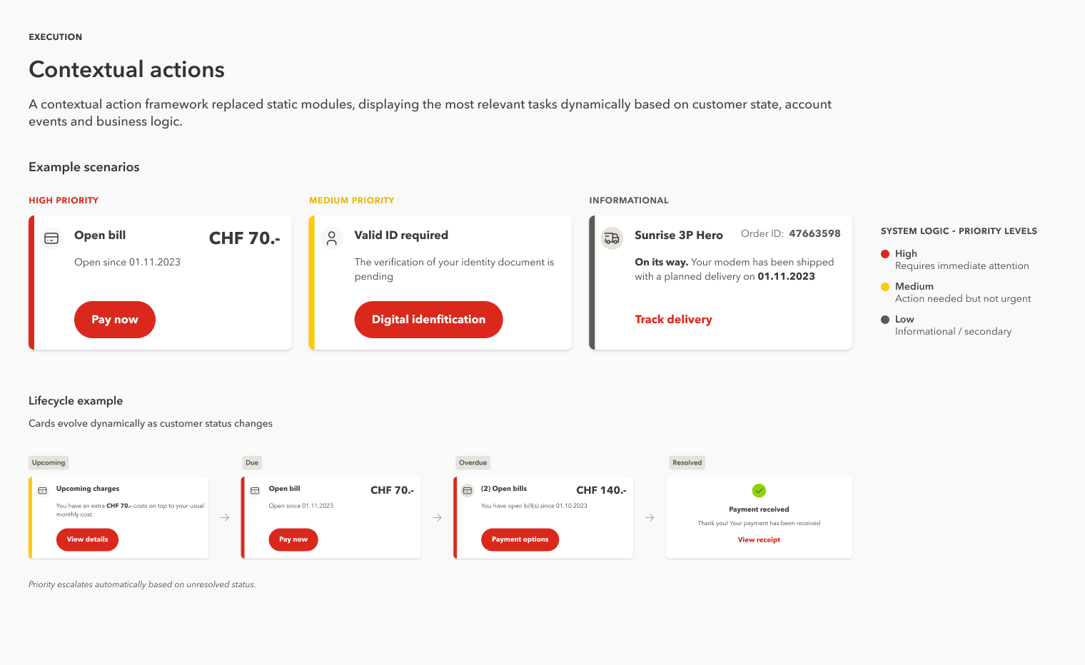
The goal was to move from a navigation driven experience to a more contextual and action base framework.
Instead of making users explore the platform, the system would guide them by displaying relevant actions based on their current context. This required rethinking how information and actions were structured across the platform.
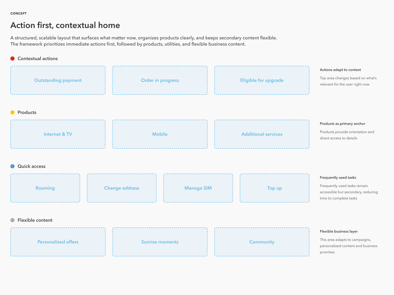
Key decisions
Testing
Usability testing showed that users navigated faster and better understood the new strcuture.
A key insight was that users preferred minimal interfaces, focusing only on actions when needed rather than constant status visibility. This reinforced the decision to prioritize contextual actions over static information.
Stakeholder Alignment
The concept was introduced to diferent product teams using low fidelity mockups to focus discussions on the model rather than visual design.
The initiative was approved and prioritized as a long term direction for the platform.
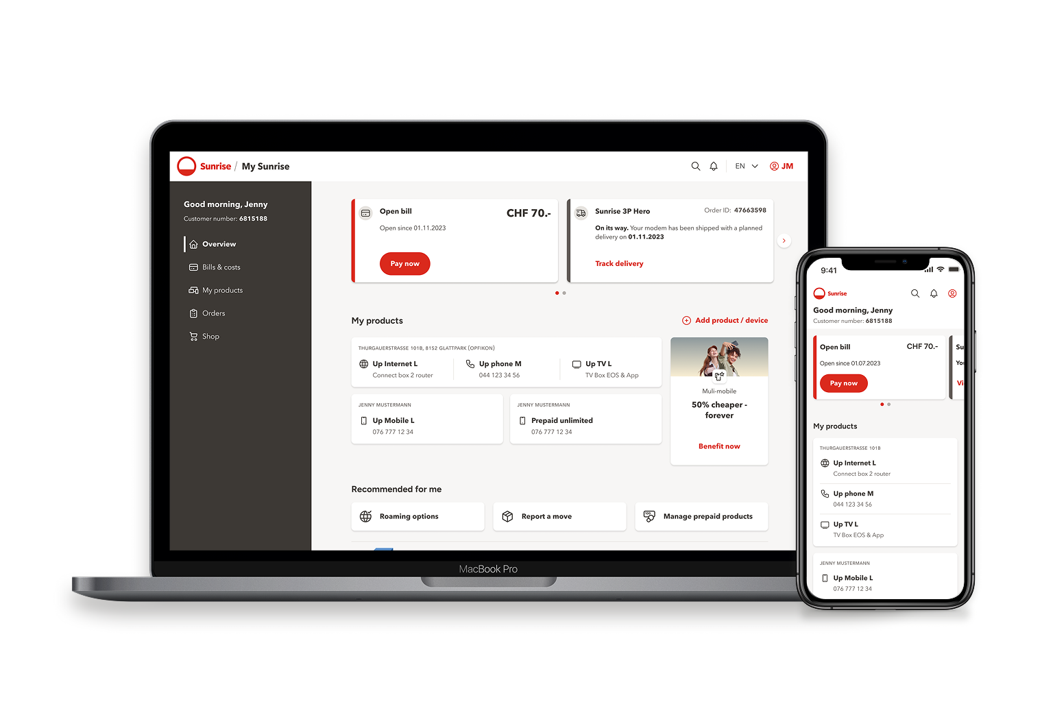
The new overview page was finally launched as an MVP, introducing the core structure and action card components.
The platform is currently evolving in phases, allowing the team to validate and scale the approach over time.
This project let me realized the importance of addressing structural limitations early and using design to aling teams around long term solutions, not just immediate needs.